SuperRigs 2020
WORK CASE 4
AGENCY: Agency
ROLE: Designer, Illustrator
Designing a bold new identity for the newest chapter in the premiere Big Rig beauty pageant.
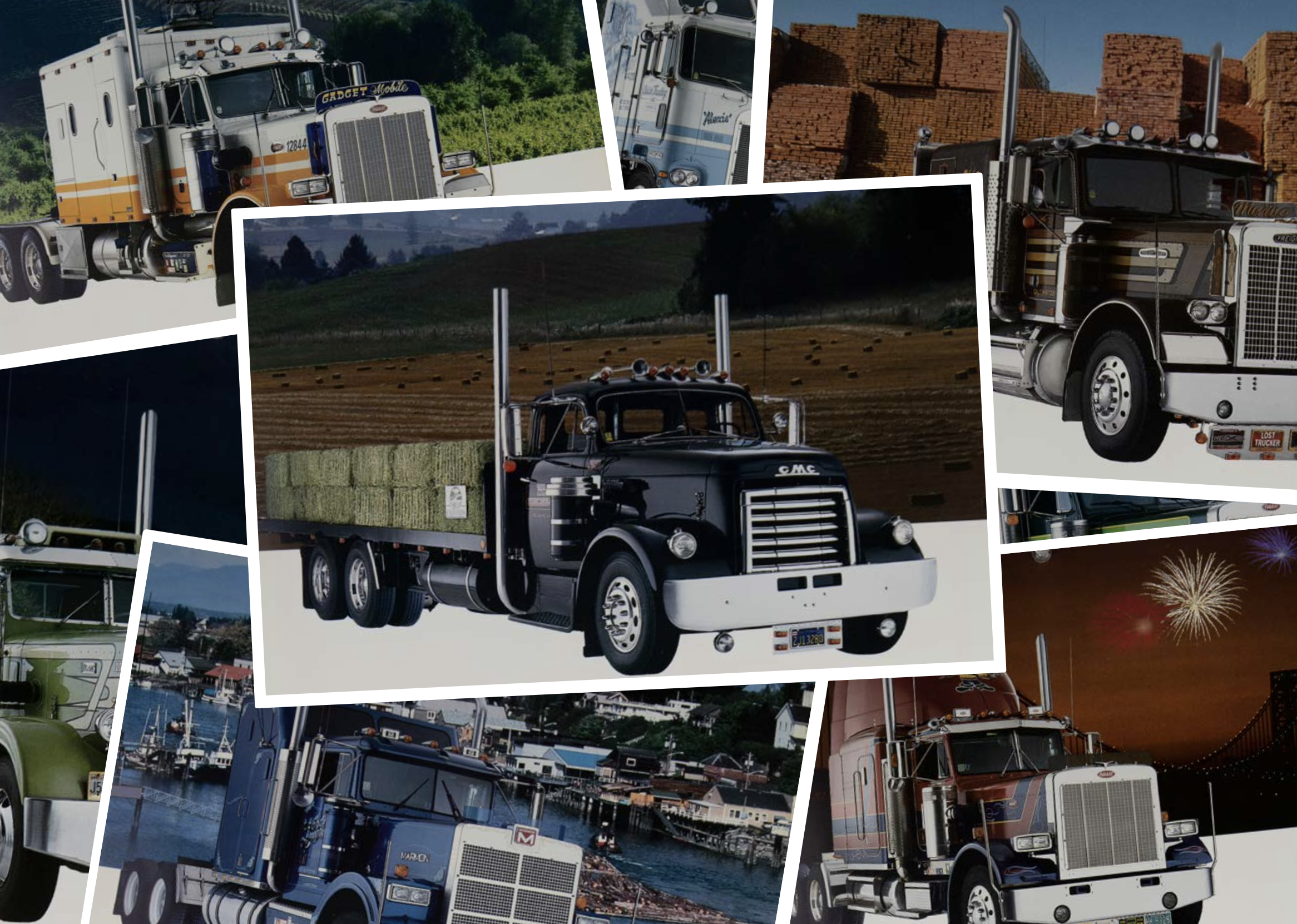
SuperRigs is Shell Rotella’s tentpole event. In this proud owners of large trucking rigs show off their candy paint jobs and big chrome wheels for pride and the chance to be a part of Shell’s annual calendar (a great honor).
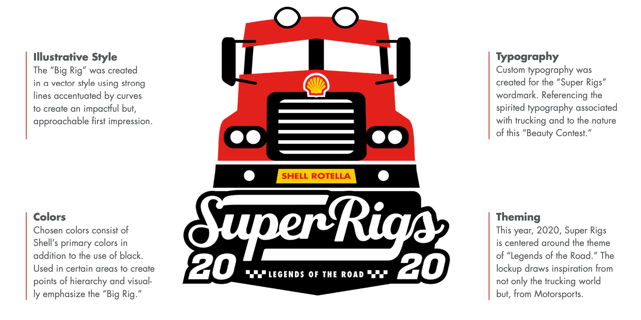
For 2020, we were tasked with designing a logo for the event that would also tie back to the huge twist. For the first time, SuperRigs was going to be held in a large speedway, the Indiana Nascar Speedway to be exact. This was the fusion of the worlds of trucking and motorsports.
To start, I began sketching several different approaches to the logo, trying to find the right balance to represent trucking while tying in the theme and location. Ultimately we went with a direction showcasing the front of a large rig while the typography leaned into the motorsports angle.
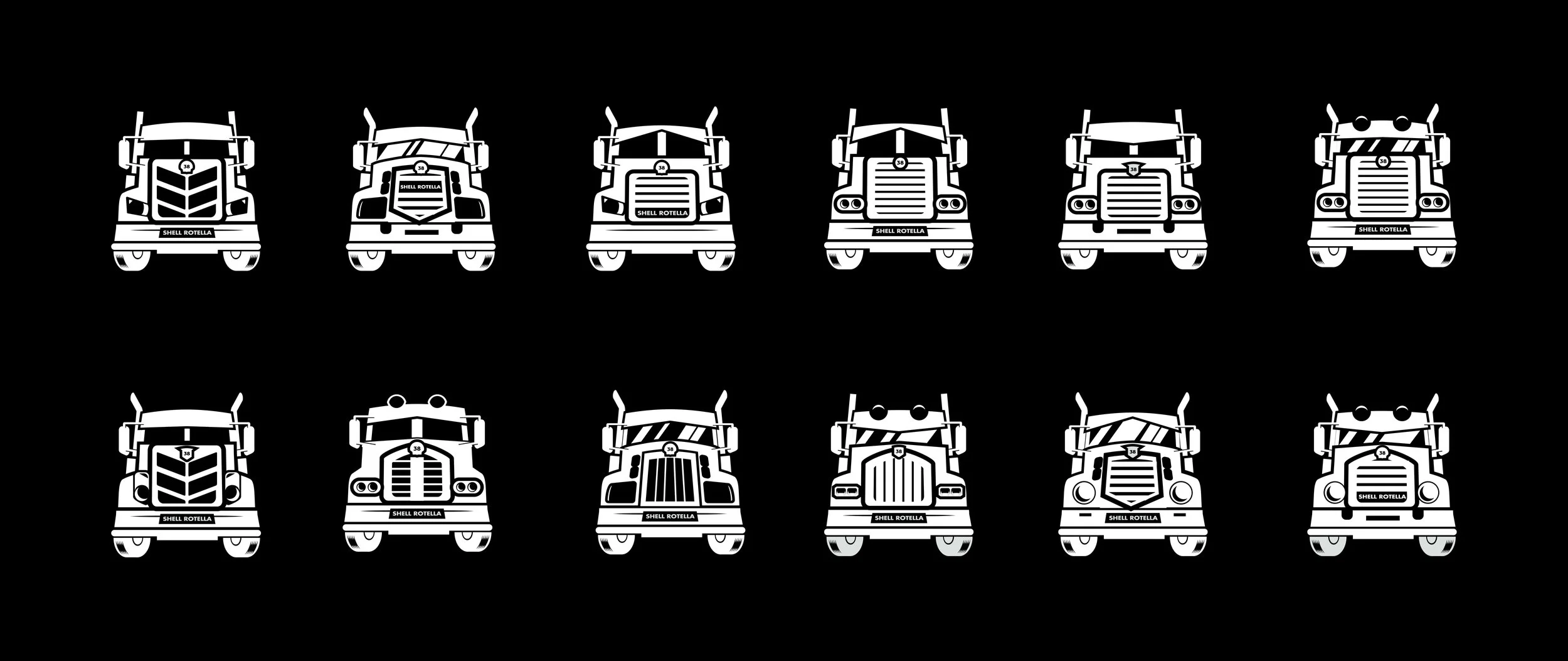
I went so far as to develop not just a base truck illustration, but a fleet of 12 variations that could be used for additional materials.
Adapting to change and making a strong pivot during hard times
So everyone was happy with the direction we came up with and the logo I designed, all that was left was to get things moving.
Then something quite significant occurred. Something that completely changed our plans and the entire globes. We entered a global pandemic in which we could not be in physical contact with one another.
So in another first we changed our event to an all digital event and had to pivot in the overall direction of the event since we no longer were going to be at the speedway. To this end we readapted the logo to fit as well as came up with a new direction for the annual calendar.


